Chromatic, not chaotic, that’s how the students & staff at Sydney College of English like it!
Do you ever walk into a yellow room & feel lively & energetic or stroll into a blue room & feel an unexpected calmness come over you? Believe it or not, colour plays a part in the controlling of our moods.
So how does it work in classrooms? When it comes to classrooms, we not only need to cover the aesthetic aspects, but also the functional part of the room. We want classrooms to be a dynamic learning hub where students can stretch their creativity beyond the walls of the room. You want students feeling relaxed, but focused, at ease, but in line with the lesson. Below are some tips & tricks that the Civic team put together for you to make use of when planning the next classroom.
1. UNDERSTAND HOW COLOUR EFFECTS MOOD:
Colour is crucial, but its not everything. Colour directly affects the mood of individuals, especially children. Mood is very important in a school, in the workplace & in daily life, therefore it is important to understand how colour affects mood. A quick reference guide is outlined below….
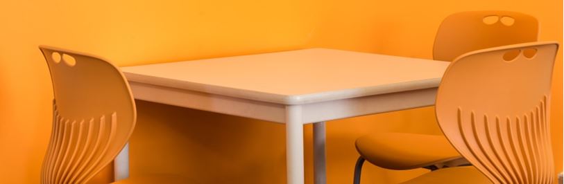
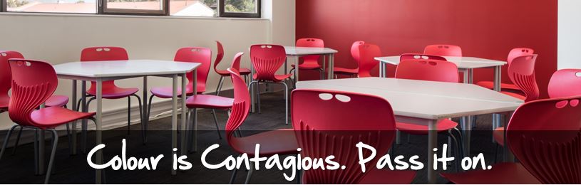
> RED & ORANGE: Stimulating
> YELLOW & GOLD: Warmth & cheerfulness
> BLUE: Calming & relaxing
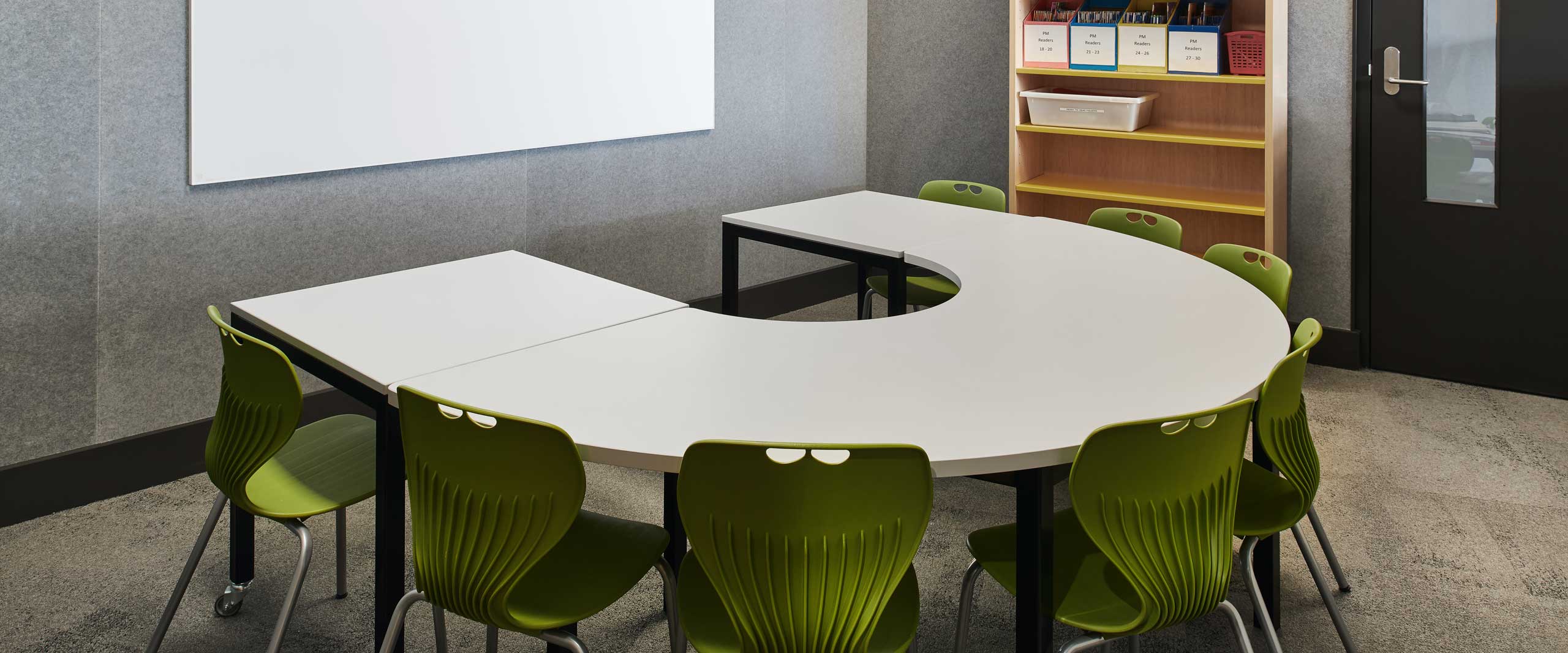
> GREEN: Hope, newness, relating to nature, peaceful & serene
> PINK, CORAL & PASTEL: Soften energy, often refer to love or fun
2. MOVE AWAY FROM SAMENESS, ITS BORING:
Studies have shown that the human brain will reject any information that is under-stimulating. A dull environement may induce anxiety & lead to irraitability to concentrate. Forget the safe, monotone look, its so way 20th century & its utterley boring! the correct use of colour can convert an atmosphere that is depressing & same-ish into one that is welcoming, exciting & stimulating. Choose a range of colours to paint the school, make every classroom a different colour, paint 3 walls in 1 colour & the 4th in a coordinating colour. For example, paint 3 walls in pale blue & the feature/teaching wall in red. This will help draw the students focus to the front of the room (mostly where the teacher is situated).
3. COORDINATE, NOT CLASH:
You will need to understand the colour wheel for this one. The colour wheel is made up of primary, secondary & tertiary colours & was first developed by Sir isaac Newton in 1666. In today’s terms; opposite colours on the wheel coordinate, while those next to each other harmonise. For example; blue & orange coordinate, while blue & purple harmonise. The correct use of colour will entice the onlooker & engage & encourage them to explore further.
4. CAN IT BE MAINTAINED?:
Classrooms are high traffic areas, so you will need to choose fabrics, finishes & paint colours that can be maintained & will hide dirty marks. Lighter colours will be more susceptible to dirty marks, however with finishes in vinyl, dirty marks can easily be cleaned with the wipe of a damp cloth. Vinyls are commonly used in primary schools, so spills can be cleaned off the furniture, whereas Commercial grade fabrics are more used in secondary schools so patterns & textures can be featured. Thats not to say the light colours are out completely, it just needs to be used wisely. For example, if you wanted to use the colour yellow for ottoman seating, choose a coordinating colour (such as blue) & have the ottoman seating predonimantly blue with spots of yellow for a feature.
5. NATURAL LIGHT IS BETTER:
All humans prefer a natural light over artificial light. maximise the use of natural light, however try not to have the glare of natural light reflecting off whiteboards & shiny surfaces. Blinds will help solve this problem. natural light also aids in mental well-being….the more daylight you see in a day, the better you feel.
6. DOES IT FEEL LIKE HOME?:
Use home as template. Ask yourself, what colours & hues make you feel comfortable? Colours that reduce tension & anxiety produce a home-like atmosphere in contrast to an institutional one. Make it homey, create quiet corners, have open break-out areas, include study units & most importantly inject colour into every area according to its use. For example, a breakout area in red & orange will stimulate activity & conversation, whereas a quiet corner in blue will calm the mind & help it to focus.
7. MAKE IT INTERESTING:
Interesting is engaging, & engaging is learning. Start with warm or cool colours & expand it from there. Desks in white & chairs in orange, beanbags in blue & ottomans in a bright stripe. There is so much you can do – a simple Google search will bring up more results than you could have asked for.
8. DO AWAY WITH CLUTTER:
Mess clogs the brain. Do away with storage space that is not necessary in a classroom. Unwanted bookshelves, cupboards, etc – stash it all in a storage room dedicated to just that – STORAGE. Classrooms need to be the canvas for creativity.
The project at Sydney College of English is a creative use of colour.
We hope these tips help. If you are looking for more ideas, you can always give us a call or send an email.
P: 1800 228 877
E: sales@civicaustralia.com.au